In this blog post, I’ll introduce the general front end design for KillrChat and its REST API.
If you have missed the previous posts on KillrChat, please go there
The application is completely open-sourced, you can get it here
I Front end design
The KillrChat front-end is built using AngularJS and Twitter Bootstrap theme and is designed as a single page application.
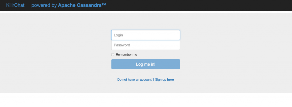
A Login page
The login screen is composed of a simple login form. You can tick the “Remember me” option to skip the login page every time you refresh you browser, as long as the remember-me cookie is still valid.
B Signup form
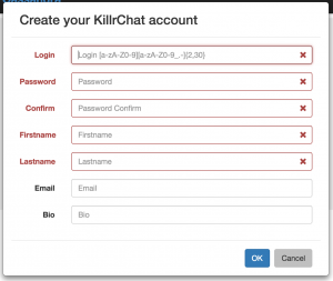
If you don’t have an account, you can create one quickly by filling a simple registration form. It is just a modal panel that appears as an overlay on the login screen.
Some constraints are applied on the registration form:
- the login should be an alpha-numeric character (_, – and . are allowed but not at the first position). The login should be of 2 characters minimum and 30 characters maximum
- there is no particular requirement on the password (in term of complexity or length). It could be a future improvement to enforce strong password
- login, password, firstname and lastname are mandatory fields. Email address and user bio are optional
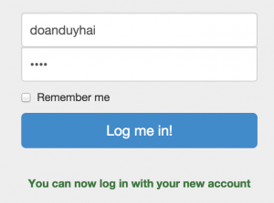
After you successfully create your account, the registration form is removed and the login form is automatically filled with the login and password you entered during the account creation. This small optimisation makes the registration process as fast as possible.
C Main layout
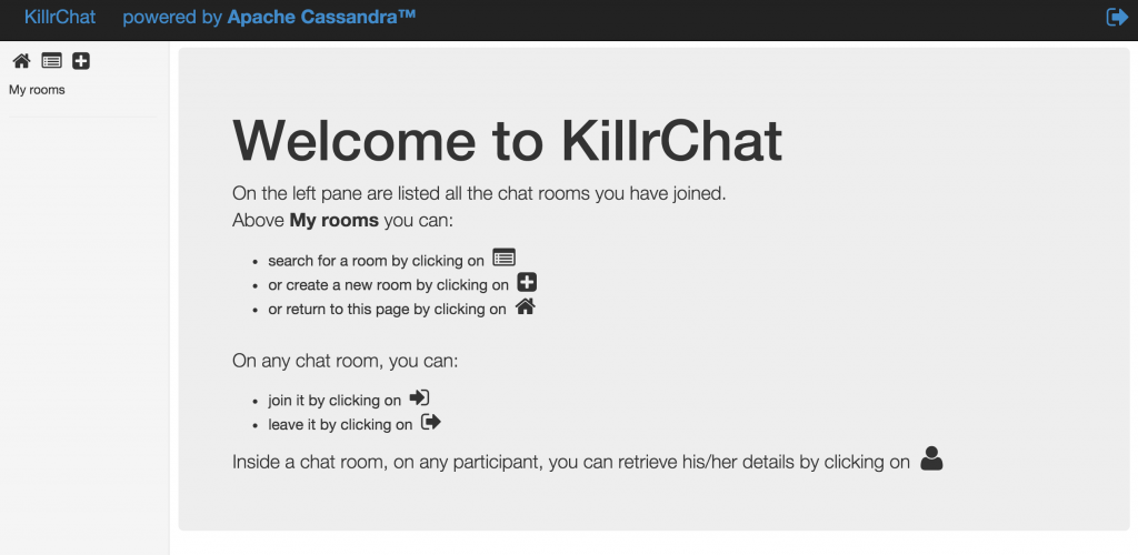
After logging into KillrChat you’ll land at the home page. The main layout consists of
3 zones:
- a top navigation bar with the sign-out icon
 on the right hand-side
 - a left panel with some icons
 to navigate in the application and a list of all chatrooms you have joined
 - a right panel which displays contextual information
D Home page
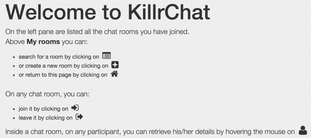
The home page is simply a page with the welcome message and some indications to use the application
E Chat room creation
By clicking on the ![]() icon on the top-left corner, you can create a new chat room.
icon on the top-left corner, you can create a new chat room.
The room name has to respect some format to avoid abuse (name having special characters like smileys etc.). Optionally you can set a chat room banner message.
Once the chat room is created, it will appears on the left column, under “My rooms”. Naturally the creator of the room will be added as the first participant of the room.
F Rooms listing
You can also have a listing of some random 100 existing chat rooms. Right now there is no feature to search room by name, it can be a future improvement.
The room listing is a table showing the room name, the creator, the number of participants and their name.
A room is displayed in bold blue if you already joined it, and in black if you’re not in.
From the listing, you can join ![]() or leave
or leave ![]() any room. The “My rooms” list on the left panel will be updated accordingly.
any room. The “My rooms” list on the left panel will be updated accordingly.
G “My rooms” list
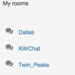
On the left panel are listed all rooms you have joined so far
To enter a room, just click on its name: ![]()
To leave a room, click on the icon on the far right: ![]()
H Chat window
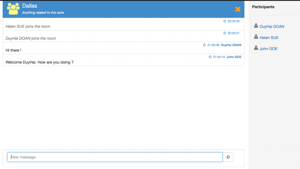
When entering the room, you’ll see a new layout:
- on the top, it’s the chat room header, with the room name and banner
- in the center of the screen is the chat messages zone, order by descending with respect to their creation time
- on the bottom is the input field where you can enter your chat message
- on the left is a list of all participants in the chat rooms
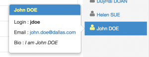
By hovering the mouse over each participant on the left, you can have detailed information on him/her
To be continued …
